How do you create an application theme?
"It’s just some CSS". Yeah, right…
Update: The new theming mechanism has been released as an official feature available in 14.6+ and 19+
There’s actually a bit more to application theming than that, especially if you want the theme to be reusable across many applications. In this experiment, we prototyped a solution for how to best organize your theme to be able to:
-
Write global CSS.
-
Write component-specific plain CSS for components with shadow roots.
-
Include static assets (like fonts and images) in the theme.
-
Include static assets or CSS from npm dependencies.
The theme can be packaged as a JAR and easily used in any Vaadin project.
Let’s look at how this all works using step-by-step instructions and and an example.
Theming a fresh application
Start by downloading a fresh default application from start.vaadin.com. Use the Vaadin 17 version, as the prototype is built for Vaadin 17 to allow it to work also work with TypeScript views.
The default application looks like this:
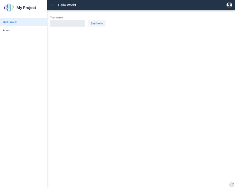
To test the prototype, you need a custom version of Flow (4.0.theme-SNAPSHOT) as this feature is not in any released version. To get the custom version, make the changes shown here to your pom.xml or copy this updated version.
If you are following this as a tutorial, run the mvn command at this point and keep the server running throughout.
Creating a theme
The first step is to create and start using the theme. We name it my-theme, but the name can be anything you like. To create your theme, add the following to the Application class:
@Theme("my-theme")And create a theme folder (to match the theme name) in
src/main/resources/META-INF/resources/theme/my-themeThis folder will contain all parts of your theme.
First, we make the smallest possible change and change the application background color. To do this, create a CSS file in the theme folder, for example
src/main/resources/META-INF/resources/theme/my-theme/global.csswith this content:
html {
    --lumo-base-color: antiquewhite;
}
Lumo defines a --lumo-base-color variable that is used as the background color. If you were to set background: antiquewhite instead, it would not take effect inside all shadow roots and the left menu bar in the application would remain white, for example.
With the new CSS rule, the application now looks like this:
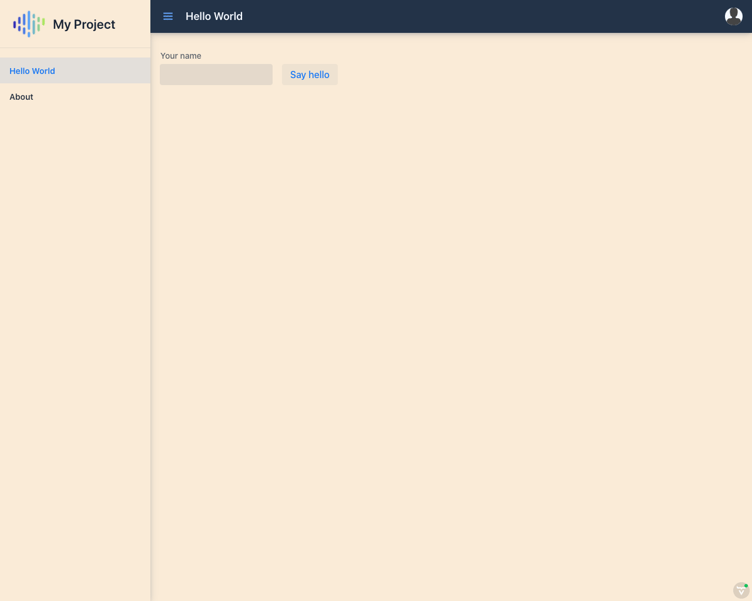
Any CSS you add in global.css (or any other file in your theme folder) is applied globally in the application.
Theming a component
To change the color of a component, like the text field, if you try something like:
vaadin-text-field {background: brown}you will end up with

This is not what you want.
To target only the input field inside vaadin-text-field, you need to find out (either using the Chrome inspector or from the documentation) whether there is a suitable element with a part=input-field attribute. Elements with a part attribute are considered "public API" for theming purposes. You CAN target any other element inside the component if you like, but those that are not marked with part may change over time.
To target the input field you write the following CSS ([attribute="value"] in CSS targets an element with the given attribute name + value):
[part="input-field"] {
  background: brown;
}
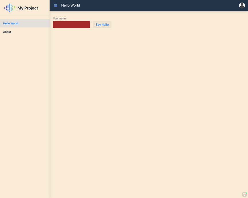
However, to work this CSS must go inside the component, so you cannot place it in the global.css file. Instead, you need to create a components folder, which is a special folder that injects styles inside the components, instead of globally. Put the above CSS in
src/main/resources/META-INF/resources/theme/my-theme/components/vaadin-text-field.cssand it will be applied to all instances of <vaadin-text-field>.The file name must match the tag name of the component for the CSS to be applied correctly.
Now the application looks like this:
Including static assets such as fonts and images
We want to use the free Ostrich Sans font that you can download from https://github.com/theleagueof/ostrich-sans/archive/master.zip. To do this, we must do two things: download the font into the project, and define in CSS that we want to load and use it.
First, download and extract the webfonts folder from the ZIP into
src/main/resources/META-INF/resources/theme/my-theme/Next, edit the global.css file by adding the needed font face definition:
@font-face {
  font-family: "Ostrich";
  src: url("theme/my-theme/webfonts/ostrich-sans-regular.ttf") format("TrueType");
}
The url needs to start with theme/my-theme for the resources to be found. |
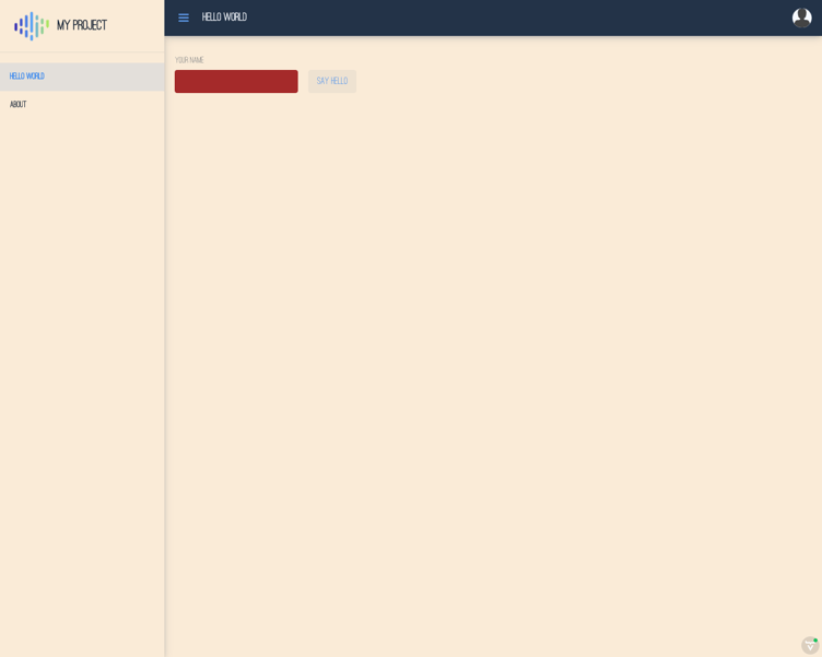
In the same file, we define that the font should be used for the whole application:
html {
  --lumo-font-family: "Ostrich";
}
The application now looks quite different:
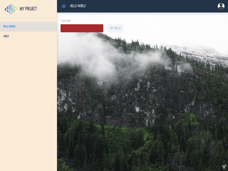
You can include images and other assets by copying them into any subfolder of your my-theme folder. You can access them in the CSS as theme/my-theme/folder-name/image.png, for example, if you want a background for the view, you can add an image to
src/main/resources/META-INF/resources/theme/my-theme/images/background.pngand then add:
body {
  background: url("theme/my-theme/images/background.png");
  background-size: cover;
}
Importing CSS from npm dependencies
Next, we include the Font Awesome icons in the theme as an npm dependency. Many libraries are distributed through npm.
First, install the npm dependency in the project using:
pnpm i --save @fortawesome/fontawesome-free(Use node_modules/.bin/pnpm i --save @fortawesome/fontawesome-free, if pnpm is not installed globally).
To use the fontawesome package, you need to load node_modules/@fortawesome/fontawesome-free/css, which refers to font files inside node_modules/@fortawesome/fontawesome-free/webfonts.
Do this by adding a theme configuration file:
src/main/resources/META-INF/resources/theme/my-theme/theme.jsonand then defining document-level imports in the file, as follows:
{
  "documentCss": ["@fortawesome/fontawesome-free/css/all.css"]
}
This includes the given CSS in the theme and processes any url() statements in the file to make sure they are found at runtime. In our case, this means the webfonts files that contain the icons.
We can now use an icon, for example by changing HelloWorldView.java to contain:
        Span hand = new Span();
        hand.addClassNames("fas", "fa-hand-sparkles");
        sayHello = new Button("Say hello", hand);
The application now looks like this:
Importing static assets from npm dependencies
If you want to refer from your code to a static asset, such as an image that is an npm dependency, you can define rules in themes.json to set the paths in which individual assets are available. For example, if you want the "regular" SVG files from Font Awesome available as http://localhost:8080/fontawesome/svg/regular/, you can add the following to theme.json:
  "assets": {
    "@fortawesome/fontawesome-free": {
      "svgs/regular/**": "fontawesome/svgs/regular"
    }
  }
You should now be able to see an image at this URL, for example: http://localhost:8080/fontawesome/svg/regular/snowflake.svg
You can refer to the SVG in your code as fontawesome/svg/regular/snowflake.svg, for example:
Image snowFlake = new Image("fontawesome/svgs/regular/snowflake.svg", "");
snowFlake.setHeight("2em");
add(snowFlake);
Try it out
You can find this example project in https://github.com/Artur-/theme-example
Making the theme reusable
In our example, the theme was created in the application project. To make it reusable in many applications, you can move src/main/resources/META-INF/resources/theme/my-theme to a separate project that creates a JAR file. Then, add a dependency to the original project and you are done.
To ensure that npm dependencies are transitively included, you need to add this to a Java file in the project:
@NpmPackage(value="@fortawesome/fontawesome-free", version="5.15.0")Vaadin scans all Java files for the annotation, but does not read package.json from your theme project.
You can find an example of our theme created as a reusable theme in https://github.com/Artur-/theme-example/tree/reusable.
You can use it in a starter project, by adding the custom Flow version (mentioned in the beginning), and then adding this theme dependency to your pom.xml:
<dependency>
    <groupId>org.vaadin.artur</groupId>
    <artifactId>reusable-theme</artifactId>
    <version>1.0.0</version>
</dependency>
and add the theme annotation to your Application.java class
@Theme("reusable-theme")